Markets don’t move in straight lines. They rotate.
Leadership passes from one asset to the next. And, if you’re not watching that rotation, you’re flying blind.
One of my favorite ways to track a shift in real-time is with a relative rotation graph (RRG), an innovation of my friend Julius de Kempenaer.
Julius, a Dutch market technician and biker, is one of the sharpest minds I’ve ever met in this business.
His RRG work changed how institutions track relative strength and momentum.
Most people use them for sectors, stocks, countries and even asset classes.
I use them for everything, especially commodities…
A Tool Most Investors Ignore
Here’s what I’m watching in the precious metals space:
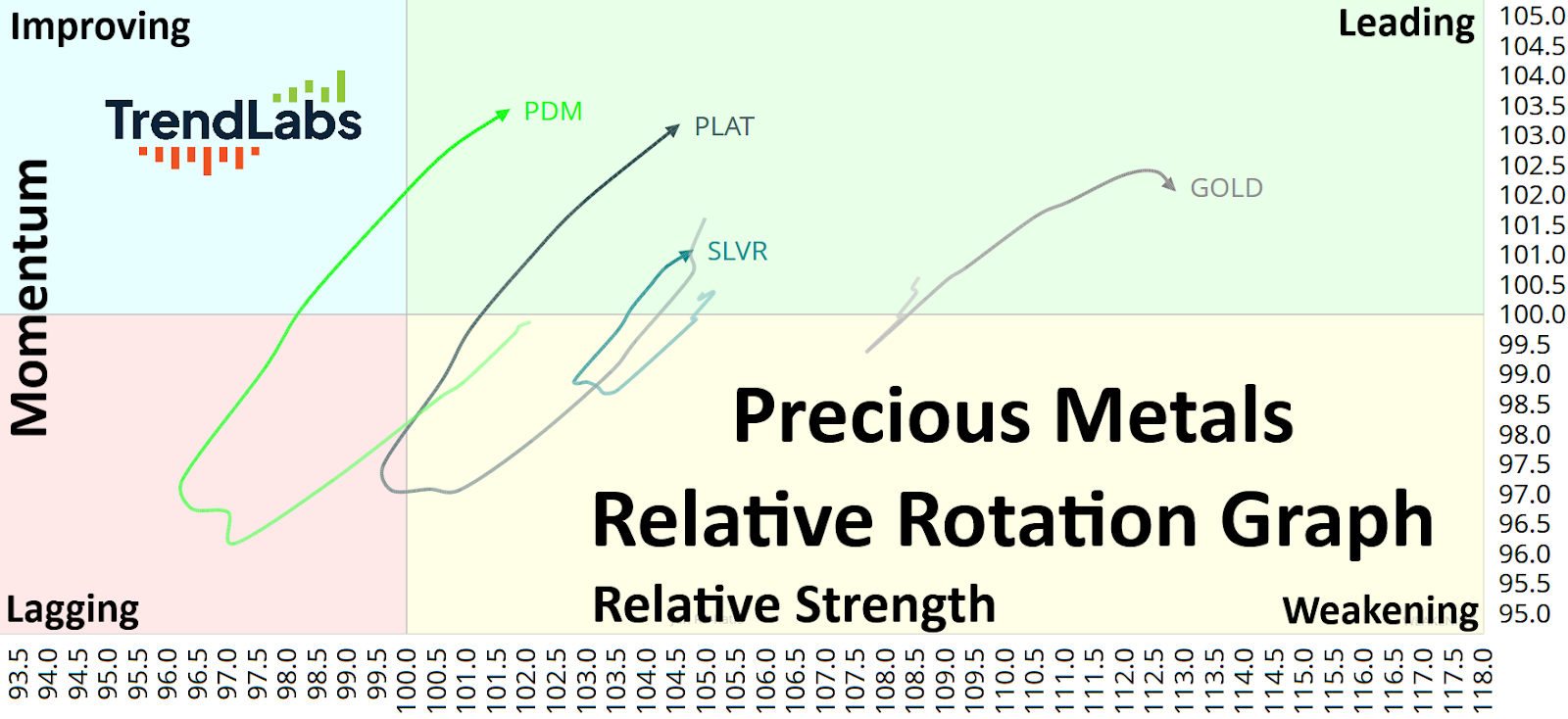
The x-axis at the bottom (horizontal axis) shows how strong a stock is compared to the overall market.
In other words, the further to the right it is, the stronger it’s been.
The y-axis over on the left (vertical axis) shows whether that strength is getting better or worse. If it’s higher on the chart, it’s gaining momentum.
The chart is split into four quadrants.
If the asset falls on the top right quadrant, it means the stock is strong and getting stronger.
The bottom right quadrant means it’s still strong but starting to slow down.
Bottom left means it’s weak and getting weaker.
The top left means it’s been weak, but it’s starting to improve.
Whichever assets you decide to plot will rotate clockwise along the RRG.
As you can see in this case above, Palladium (PDM), Platinum (PLAT), Silver (SLVR), and Gold (GOLD) are all rotating around the graph.
Gold has been the leader, but it’s starting to curl lower. It looks like a tired leader.
Silver has also been a leader, but there isn’t much momentum behind the trend.
It’s Platinum and Palladium that really stand out to me, as they enter the Leading quadrant.
Here’s another way to view the same data:
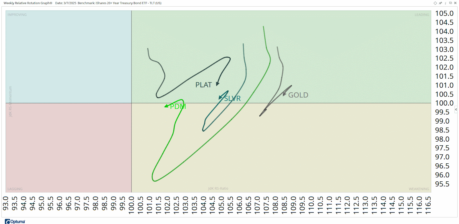
This is the same RRG you saw before, but it’s moving.
With this visual, you get a better understanding of how these lines got to where they are today.
What stands out to me is how Platinum and Palladium rotated from the Lagging quadrant all the way back to Leading.
Gold and Silver, on the other hand, didn’t get anywhere close to the Lagging quadrant.
They’ve been steady leaders for the last few months. But I think there’s a major rotation coming into Platinum right now.
Beginning of the Real Trend
Platinum futures just resolved a multi-decade consolidation:
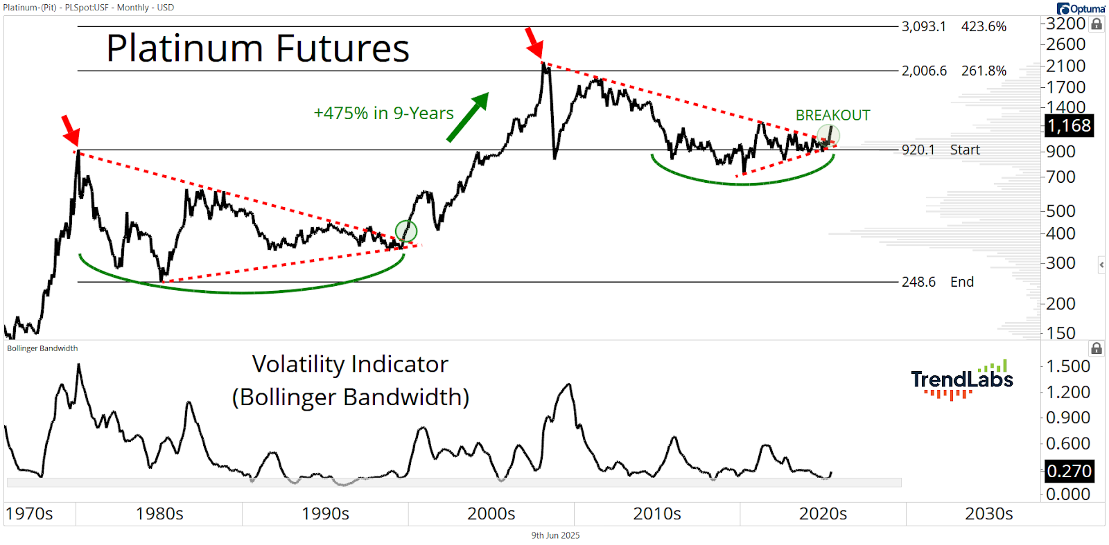
The crowd still wants Gold – I get it.
But, remember, leadership roles rotate.
And, right now, Platinum is breaking out.
After peaking in 2008, the price of Platinum suffered a multi-decade downtrend and revisited its prior cycle’s peak from way back in 1980.
The key level here is around 920, which held as support for the last decade.
Platinum futures are clearing a multi-decade downtrend line, and price is ripping higher.
Since the April 7 low, Platinum has rallied more than 35%.
Aside from Orange Juice, that’s the best return in the entire commodities complex over that time frame.
And, based on the way Platinum is rotating on the RRG, this isn’t just a bounce.
It’s a trend shift that could last for many years.
This is the kind of setup I live for.
Everybody’s wrong.
They think the move already happened.
But the real trend is just beginning.
Stay sharp,
JC Parets, CMT
Founder, TrendLabs