
When people want to know how the stock market is doing, they almost always look at the biggest companies. That’s understandable.
The largest businesses grab the headlines, move the indexes the most, and seem to dominate every conversation.
But if you’re trying to judge the health of the market, I’d argue those aren’t the companies you should be watching first.
I’d rather know what’s happening to the stock sitting right in the middle.
Not the biggest winner, and not the biggest loser, but the one halfway between them.
Because if you reached into a basket of roughly 1,700 stocks and pulled one out without looking, chances are you’d end up with something pretty close to that middle stock.
And if that random company is doing well, history says the market underneath the surface is probably doing well too.
The Middle Usually Tells the Truth
Most of us remember learning about averages in school.
You add everything together, divide by the number of observations, and you have the average. That’s called the “mean.”
The “median” is different.
Imagine lining up about 1,700 stocks from the worst performer to the best performer. The median is simply the one standing in the middle. Half the market is doing better. Half is doing worse.
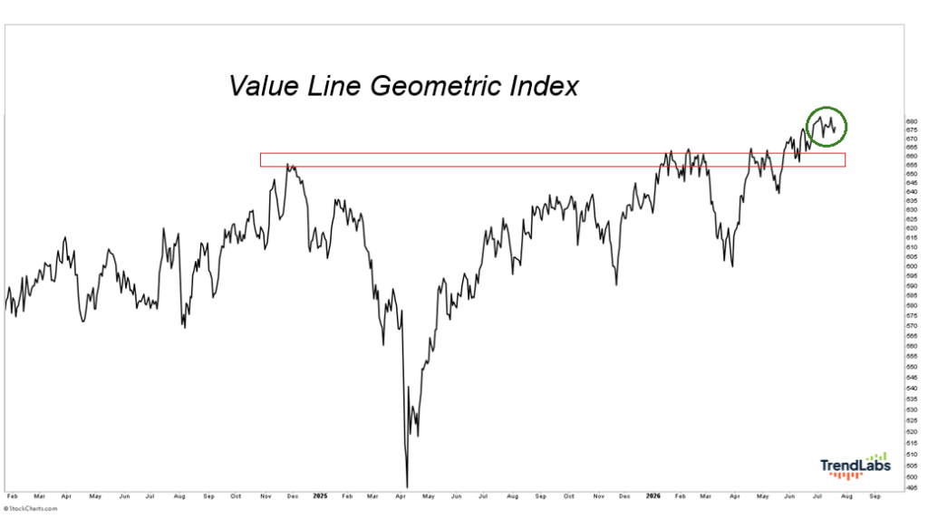
The Value Line Geometric Index is one of the closest things we have to tracking that middle stock. It’s been around since 1961 and follows roughly 1,700 companies.
Instead of allowing a handful of giant stocks to dominate the calculation, it uses a geometric average that behaves much more like the performance of the typical stock.
Here’s why that’s so powerful.
Imagine there are only three stocks in the entire market. One doubles. One doesn’t move. One gets cut in half.
A normal average would tell you the market gained almost 17%.
That doesn’t really describe what happened.
One company had a spectacular day. Another had a terrible one. The third barely moved.
The geometric calculation says the market was basically flat because the huge winner and the huge loser offset one another. That feels much closer to the experience of the typical investor.
That’s why I’ve always loved this index.
It answers a simple question better than almost anything else:
If I picked a random stock out of the middle of the market, how is it probably doing?
What It Means Today
One thing I’ve learned over the years is that healthy bull markets don’t rely on a handful of stocks to do all the heavy lifting. They become healthier as more companies participate.
Leadership spreads. More stocks begin making new highs. More industries contribute. The strength becomes broader instead of narrower.
That’s exactly what the middle of the market is telling us today.
This same index rolled over well before the dot-com bubble burst. It weakened before the Financial Crisis.
In both cases, the typical stock started struggling before the major averages made their final peaks.
Today, we’re seeing the opposite.
The middle stock is doing great. It just recorded another new high.
That isn’t what you’d expect to see if the foundation of this market were cracking.
Stuck in the Middle With You
No single chart should ever make your investment decisions.
The goal is to collect evidence. Every chart gets a vote. Then you step back and see whether they’re telling the same story.
Right now, they are.
The major indexes are healthy. Market breadth is healthy. Participation continues to expand.
And now one of the best gauges of the typical stock is confirming all of it.
Everybody spends so much time talking about the biggest companies that they forget about everyone else.
But that’s the group I care about.
Because when the stock “stuck in the middle with you” is making new highs, history says the market is usually in pretty good shape.
Sometimes the most important stock in America isn’t the biggest one.
It’s the one in the middle.
Stay sharp,
JC Parets, CMT
Founder, TrendLabs