
Founder’s Note: At the end of the day, this is a numbers game.
So it’s always comforting to know that Grant Hawkridge is manning the barricades when and where the day begins.
Nobody knows market numbers like our man Down Under, and here’s Grant with another look at what’s really happening with stocks right now… – JC
By Grant Hawkridge
- One of the market’s most watched trend lines gave way this week.
- Underneath the index, something very different had already been happening.
- I went back through the data to see what tends to happen from here.
Most of you know me as Grant.
What some of you might not know is that I’m actually the quantitative analyst here.
That means a fair part of my job involves counting things.
How many stocks are going up? How many are going down? How many are making new highs? How many are trading above their moving averages?
In markets, we call that “breadth.” It sounds simple because it is.
But I’ve always liked breadth because an index can hide a lot.
The S&P 500 is one number, but underneath that number are 500 individual companies spread across 11 different sectors. Those stocks are not all behaving the same way.
Sometimes the index is rising, and most of the market is moving higher with it. Other times, the index can continue looking healthy while fewer and fewer stocks underneath it are keeping up.
That’s why we count.
Instead of only asking what the S&P 500 is doing, breadth allows us to ask a second question.
How many stocks are doing it with it?
Right now, that second question is giving us a very different view of the market.
The S&P 500 Has Joined the Pullback
Let’s start with the chart most investors will be looking at:
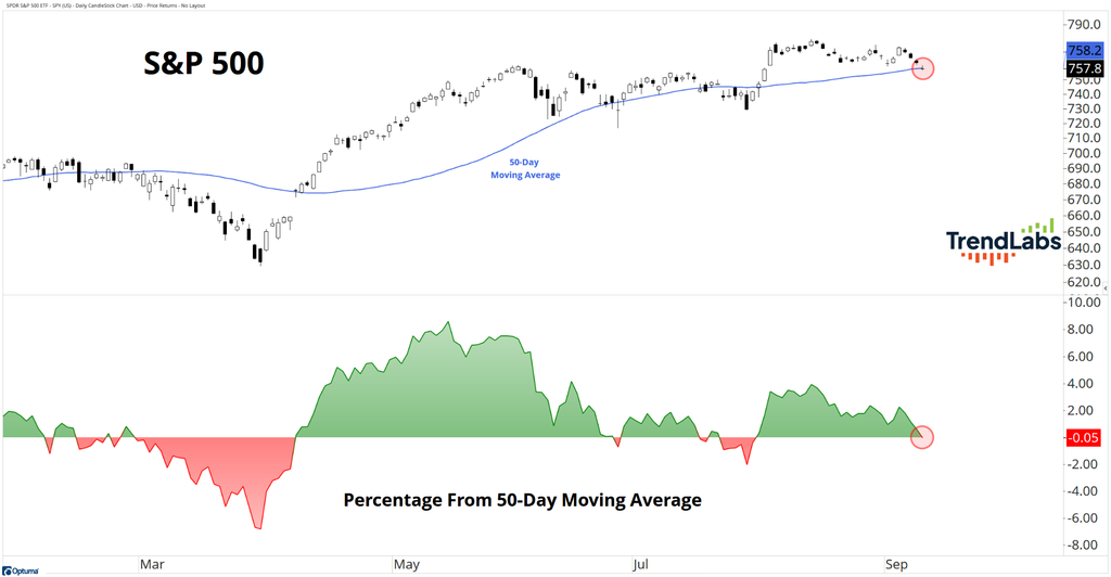
The S&P 500 has now closed below its 50-day moving average.
For anyone unfamiliar with moving averages, the calculation is straightforward.
The 50-day moving average takes the average closing price over the previous 50 trading sessions and plots it as a line.
It’s one simple way of measuring the intermediate trend.
When price is holding above its 50-day moving average, the recent trend is generally healthy. When price falls below it, some of that strength has started to fade.
But the S&P 500 is only the headline.
Underneath the index, the pullback had already been underway for weeks.
The Sectors Were Already Telling Us Something
Before getting down to individual stocks, I like to look one layer below the index.
There are 11 S&P 500 sectors, so we can simply count how many remain above their own 50-day moving average:
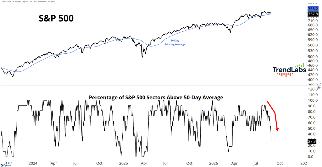
Right now, only three of the 11 sectors are above theirs. That’s 27.3%.
A few weeks ago, almost every sector was trading above its 50-day moving average.
That;s a very different backdrop.
While the S&P 500 itself was still holding above its intermediate trend, participation across the sectors had already been fading.
Now let’s take it one step further.
The Average Stock Has Been Correcting for Weeks
Instead of counting sectors, we can count the stocks themselves:
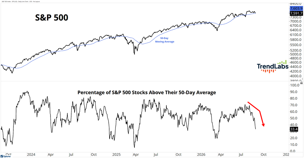
Only 33.4% of S&P 500 stocks are currently trading above their own 50-day moving average.
A few weeks ago, that reading was close to 70%.
So roughly two-thirds of the stocks inside the S&P 500 had already fallen below their intermediate trend before the index itself finally joined them.
That’s the breadth story in one chart.
The average stock has been correcting for weeks. The S&P 500 is only now beginning to reflect some of that weakness.
Breadth didn’t predict that the index had to fall below its 50-day moving average.
It simply showed us that participation was deteriorating underneath it well before the weakness became obvious in the headline number.
But losing an intermediate trend and losing a longer-term trend aren’t the same thing.
That’s where the next reading becomes useful.
The Longer-Term Picture Looks Better
We can run exactly the same breadth calculation using the 200-day moving average:
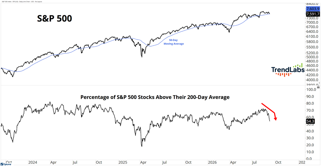
Right now, 54.3% of S&P 500 stocks remain above their 200-day moving average.
Compare that with only 33.4% above their 50-day moving average.
There’s a meaningful gap between those two readings.
A large part of the market has lost its intermediate trend, but more than half of S&P 500 stocks are still holding above their longer-term trend.
So, plenty of stocks have been through a decent pullback without yet breaking down over the longer term.
That led me to the question I really wanted to answer.
When breadth deteriorates like this, are we usually looking at the beginning of something much worse, or a pullback that is already well advanced within a larger advance?
So I went back through the numbers.
What Happened After Similar Breadth Resets?
I started with every previous occasion when the S&P 500 first closed below its 50-day moving average.
Then I added the current stock breadth condition.
There have been 18 previous occasions in our breadth history when the S&P 500 first closed below its 50-day moving average with 33.4% or fewer stocks still above their own 50-day moving average.
I was less interested in what happened over the next few days and more interested in what happened once the market had time to work through the reset.
Six months later, the S&P 500 was higher 88.9% of the time, with an average gain of 8.3%.
Twelve months later, it was higher 72.2% of the time, with an average gain of 11.9%.
That caught my attention.
So I made the test harder.
Today, breadth hasn’t simply fallen to 33.4%. It’s also dropped by more than 30 percentage points from its recent 20-day high.
There have only been 12 previous examples where the S&P 500 first lost its 50-day moving average, no more than 33.4% of stocks remained above theirs, and breadth had fallen at least 30 percentage points from its recent high.
It’s a small sample, so I’m not going to make a big market call from it.
But six months later, the S&P 500 was higher 91.7% of the time, with an average gain of 7.8%.
Twelve months later, it was higher 83.3% of the time, with an average gain of 11.9%.
The three-month results were much messier.
I actually think that is useful.
A breadth reset doesn’t mean everything suddenly becomes easy. Markets can spend plenty of time chopping around while trends repair and participation rebuilds.
But when I looked further out, these historical resets behaved much more like pullbacks within larger advances than the beginning of prolonged declines.
A Pullback and a Bear Market Are Not the Same Thing
This is where I think the distinction becomes important.
The breadth readings are weak, but the weakness is much more pronounced across intermediate trends than longer-term trends.
Then there’s the history.
Similar breadth resets have generally produced positive six- and 12-month returns, while the three-month results have been much less convincing.
That doesn’t mean this pullback is finished.
It also doesn’t mean the current market has to follow the historical average.
But when I put the current breadth readings alongside the previous examples, I see more similarities with an intermediate-term reset inside a larger advance than the early stages of a prolonged bear market.
From here, I don’t need to guess which way it goes.
I want to see how the numbers change.
Do more stocks begin reclaiming their 50-day moving average?
Do more sectors join them?
Or does the weakness spread further into the 200-day moving average breadth reading?
Those are all things I can measure.
My job is to keep counting.
Because the S&P 500 gives us the headline.
Breadth helps us understand what is actually happening underneath it.
Happy hitting🏌️⛳
Grant Hawkridge
Quantitative Analyst, TrendLabs