
Over the past month, we’ve spent a fair bit of time examining what’s been happening underneath the S&P 500.
A few weeks ago, I went deep into breadth and the weakness developing across individual stocks and sectors.
Two weeks ago, I looked at the presidential cycle and found that we were entering what has historically been the strongest seven-month window for the index.
Both studies gave us useful information.
This week, I want to step back and look at something much simpler.
The primary trend.
Because while we’ve been examining the details, the S&P 500 has continued to make progress.
And, on Tuesday, it recorded another all-time high. That got me thinking about something.
We spend a lot of time worrying about when the next correction might arrive, or whether a bull market has already gone too far.
But what does the evidence actually say about the trend we’re in today?
So I went back through more than 70 years of market history to find out.
The Primary Trend Is Still Pointing Higher
Let’s start with the chart I consider most important:
The chart counts the number of S&P 500 all-time highs recorded in each calendar year since 1950.
Across the 76 completed years through 2025, the index averaged 19.9 all-time highs per year.
We’ve already recorded 28 this year, with almost three months still remaining.
That means 2026 has already produced more all-time highs than 49 of the previous 76 full calendar years.
But I think there’s something more interesting in the table than this year’s number alone.
Look at how those all-time highs tend to arrive.
They cluster.
Between 1995 and 1999, the S&P 500 recorded 243 all-time highs. Every one of those five years produced at least 35.
From 2013 through 2021, the index made new highs in nine consecutive calendar years, recording 345 in total.
Now, compare those periods with the stretches when the market struggled.
There wasn’t a single new all-time high from 1974 through 1979. The same thing happened from 2001 through 2006.
Those are very different market environments.
When the market is struggling through a prolonged decline or recovery, it can spend years without reaching a new record.
But during sustained advances, buyers repeatedly push prices into territory the market has never traded before.
And that’s exactly what we’ve been seeing recently.
The S&P 500 recorded 57 all-time highs in 2024, another 39 in 2025 and now 28 in 2026.
That’s 124 new all-time highs since the beginning of 2024.
Over the past three calendar years, the S&P 500 has repeatedly pushed into record territory, despite the corrections, pullbacks, and periods of uncertainty along the way.
I don’t look at an all-time high and automatically assume the market has gone too far.
I see evidence that buyers are still willing to pay higher prices.
And when those records keep arriving alongside a positive primary trend, I pay attention.
So What Am I Doing With It?
Over the past month, we’ve looked at several different ways of measuring the market.
Breadth showed us where participation had weakened. Seasonality gave us historical context for the months ahead.
And now the primary trend is reminding us of something important.
The S&P 500 is still in a bull market.
That doesn’t mean every pullback is finished or that every stock is going to participate.
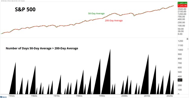
But with the index holding above a rising 200-day moving average and continuing to make new all-time highs, the longer-term evidence remains positive.
So I’m still approaching this market from the bullish side, focusing on the stocks and sectors showing the strongest leadership.
If the primary trend begins to deteriorate, I’ll adjust.
But I’m not going to become defensive simply because an uptrend has lasted longer than average.
We’ve just seen another all-time high, the 28th this year, and the longer-term trend is still pointing higher.
At some point, that will change. Every bull market eventually ends.
But I don’t see a reason to treat this one as finished while price continues telling us otherwise.
For now, the evidence is straightforward. We’re still in a bull market.
And I’m going to keep treating it like one.
Happy hitting🏌️⛳
Grant Hawkridge
Quantitative Analyst, Everybody’s Wrong