
By Grant Hawkridge
Two weeks ago, I took over the Saturday note and went deep into breadth.
At the time, the S&P 500 had just closed below its 50-day moving average, but underneath the index the pullback had already been underway for weeks.
Only 33.4% of S&P 500 stocks were still above their own 50-day moving average, while just three of the 11 sectors were above theirs.
When I went back through similar breadth resets, the short-term results were messy. Further out, they looked considerably better.
This week, I’ve been counting again.
Only this time, instead of studying breadth, I went looking at the calendar.
And there’s a seven-month stretch beginning next Thursday that caught my attention.
The Presidential Cycle
Most investors have probably heard of the four-year presidential cycle. The idea is straightforward.
Instead of treating every year the same, we can separate the market into the post-election year, midterm year, pre-election year and election year, then look at how the S&P 500 has historically behaved through each part of the cycle.
Here’s the average path across the completed cycles in the study:
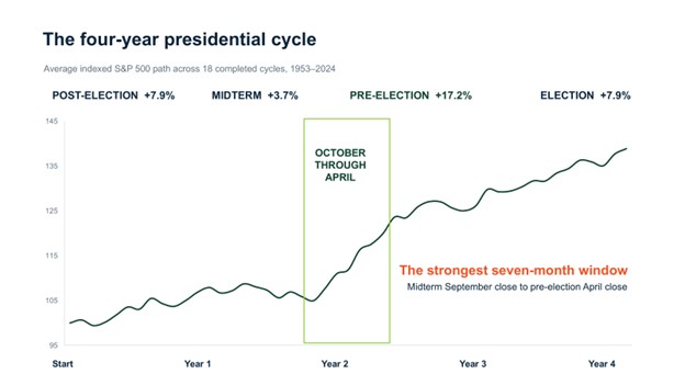
The pre-election year stands out.
Across those completed cycles, the S&P 500 gained an average 17.2% during the pre-election year. That compares with 7.9% in the post-election year, 3.7% in the midterm year, and 7.9% in the election year.
We’re currently approaching the end of September in a midterm year.
So that got me wondering.
If the pre-election year has historically been the strongest part of the presidential cycle, when has that strength typically started?
I decided to test it.
I Tested Every Seven-Month Window
Rather than stopping at the four calendar years, I tested every possible seven-month starting point across the presidential cycle.
There are 48 of them, which gave me a way to compare the period we’re about to enter with every other seven-month window in the cycle.
Then I ranked them by their average S&P 500 return.
One period stood comfortably above the rest:
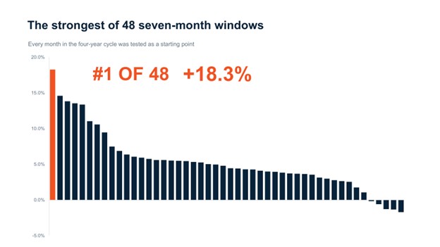
The strongest historical seven-month window begins at the September month-end of the midterm year and runs through the April month-end of the pre-election year.
Its average S&P 500 return is 18.3%, ranking first among all 48 possible seven-month starting points in the presidential cycle.
And we’re about to enter it, next Thursday.
But there’s an obvious question I needed to answer before getting too excited about that result.
October through April is already known as a stronger part of the calendar.
Was I simply rediscovering ordinary seasonality?
This Is More Than Ordinary Seasonality
To find out, I compared three things: every rolling seven-month period, every October-through-April period, and October-through-April specifically when it begins in a midterm year and finishes in the pre-election year.
Across all rolling seven-month periods through 2025, the S&P 500 produced an average price return of 5.4%, with 72.6% finishing higher:
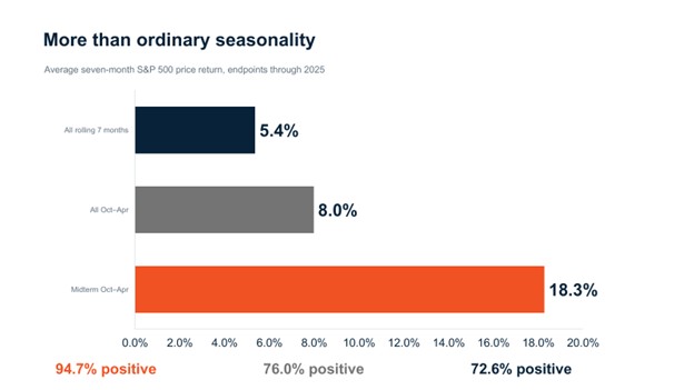
For every October-through-April period, the average improved to 8.0%, with 76.0% finishing higher.
So there’s clearly something to ordinary seasonality.
But when October through April fell specifically between the midterm and pre-election years, the historical numbers changed considerably.
The average return jumped to 18.3%, while 94.7% of those periods finished higher.
That’s more than twice the average return of an ordinary October-through-April period.
Still, averages can hide a lot.
A handful of enormous gains can make a historical tendency look much stronger than the typical experience.
So I went back and looked at every individual occurrence.
18 of 19 Finished Higher
There have been 19 completed periods in the study.
Here they are:
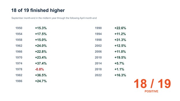
Eighteen of the 19 periods finished higher.
The only exception began in 1978, when the S&P 500 declined 0.8% between the September month-end and the following April month-end.
Some of the gains were enormous. The period beginning in 1974 returned 37.4%, while 1982 gained 36.5%, and 1998 gained 31.3%.
Others were much quieter. The period beginning in 2018 gained just 1.1%, while 2014 gained 5.7%.
But 94.7% positive does not mean 94.7% easy.
Those numbers only compare where the S&P 500 started with where it finished seven months later.
They don’t show us everything investors had to sit through in between.
And, given what we were talking about two weeks ago, that was something I wanted to see.
The Path Was Anything But Straight
I took all 19 periods, indexed them from the September month-end, and averaged their paths through the following April month-end.
The direction is clearly higher, but the journey wasn’t nearly as smooth:
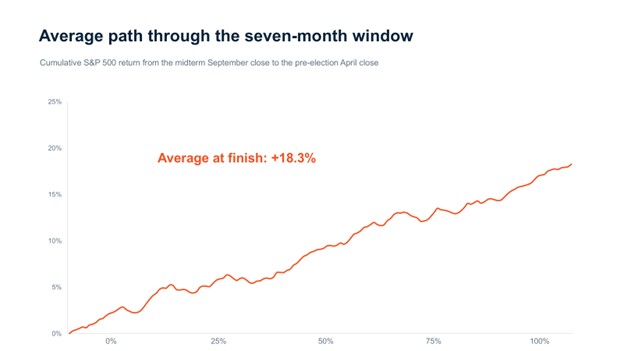
Even during what’s historically been the strongest seven-month window of the presidential cycle, there were pullbacks, pauses, and periods where the market made very little progress.
That brings us back to where we are today.
Two weeks ago, the breadth numbers showed us a market working through an intermediate-term reset.
The average stock had already been correcting for weeks, sector participation had narrowed, and, eventually, the S&P 500 joined the pullback by losing its own 50-Day Moving Average.
Now we have another piece of evidence to consider.
History says we’re about to enter a period that’s been unusually favorable for the S&P 500.
But seasonality doesn’t make weak breadth disappear.
And an average historical path doesn’t tell us what the S&P 500 has to do this time.
It gives us context.
So What Am I Doing With It?
Two weeks ago, I finished by saying I didn’t need to guess which way the market went next.
I still don’t.
The breadth numbers showed us a market working through an intermediate-term reset.
Now the calendar tells us we’re about to enter a seven-month period that has historically been unusually strong.
One doesn’t override the other.
What I want to see is whether they begin confirming each other.
Do more stocks start reclaiming their 50-day moving average? Do more sectors join them? Does leadership begin expanding again?
Those were the questions I was asking two weeks ago.
If the answers begin turning positive as we move into this historical window, I’ll have two very different pieces of evidence beginning to point in the same direction.
If participation keeps deteriorating, I’m not going to ignore what’s happening in front of me simply because the calendar says stocks are supposed to go up.
Price still comes first.
But starting next Thursday, history gives us one more reason to pay very close attention to what happens next.
Happy hitting🏌️⛳
Grant Hawkridge
Quantitative Analyst, Everybody’s Wrong