
Bitcoin is sitting around $75,000. That’s a long way from its highs.
There are people sitting on enormous profits. There are other people sitting on painful losses.
You’d think somebody would be doing something.
The people who bought Bitcoin at $20,000 should be taking victory laps and cashing out.
The people who bought near the highs should be getting nervous.
Traders should be trading. Investors should be investing.
But here’s the weird part.
Compared with the enormous amount of money sitting in Bitcoin, not much is happening at all.
The winners aren’t rushing to take their profits.
The losers aren’t throwing in the towel.
Everybody is just sort of sitting there.
Take a look at this chart:
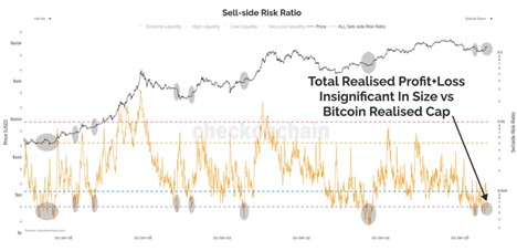
The black line is the price of Bitcoin.
The orange line is something called the “sell-side risk ratio”.
Don’t let the name scare you. The idea is actually pretty simple.
It looks at the profits and losses Bitcoin investors are locking in when they sell their coins. Then it compares that activity with the total amount of money invested in Bitcoin.
Let’s say you bought Bitcoin at $50,000 and sold it at $80,000. You just locked in a $30,000 profit.
Someone else bought at $110,000 and sold at $90,000. They just locked in a $20,000 loss.
This indicator looks at activity like that across the entire Bitcoin network and asks one simple question:
How much profit and pain are investors actually taking compared with the size of the whole thing?
Right now, the answer is:
Not much.
And here’s something I don’t want you to miss.
We can calculate this because Bitcoin is transparent.
Every Bitcoin has a history. We can see when coins moved, what prices they moved at, how long they sat there, and when they moved again.
Think about how crazy that is.
In traditional finance, we can see that someone sold a stock today. But we usually have no idea when that person bought it or what price they paid.
With Bitcoin, the blockchain gives us a much clearer history of the money moving around the network.
That’s what I mean when I say crypto is building the rails for the future of finance.
It’s not just about Bitcoin going up or down.
It’s about having a financial system where the movement of money can be observed and measured in ways that simply weren’t possible before.
Imagine a Giant Boulder
Here’s an easier way to think about it.
Imagine Bitcoin is a giant boulder. The bigger Bitcoin gets, the bigger the boulder gets.
Today, Bitcoin is enormous. There are trillions of dollars involved.
Now imagine investors pushing on that boulder.
Every time someone decides their profit is big enough and sells, they’re pushing on it.
Every time someone finally gives up on a losing position and sells, they’re pushing, too.
Sometimes there are lots of people pushing really hard.
That’s when the orange line on this chart jumps higher.
But look at it today.
That’s a gigantic boulder, and hardly anybody’s pushing.
That’s what the orange line near the bottom of the chart is telling us.
It does NOT mean Bitcoin isn’t trading. Obviously, Bitcoin trades every second of every day.
It means the amount of profit and loss being locked in is tiny compared with the enormous size of Bitcoin itself.
There’s a huge boulder sitting there.
But there’s very little force being applied to it.
We’ve Seen This Before
Now look at the gray circles on the chart.
Those show other times when the sell-side risk ratio fell to extremely low levels.
In other words, other times when the pushing got very weak compared with the size of the boulder.
Sometimes this happened after Bitcoin got crushed.
Other times it happened while Bitcoin was resting after a big move.
And that’s important.
Because this indicator does not tell us which way the boulder rolls next.
It tells us that, at the current price, investors aren’t pushing very hard.
And eventually, something has to change.
How Much Force Will It Take?
This is my favorite part.
A giant boulder can sit still when nobody’s pushing it. But give it enough force, eventually it moves.
Bitcoin works the same way.
At the current price, neither the winners nor the losers seem particularly motivated to sell.
Everyone apparently needs a better offer.
Maybe Bitcoin has to go higher before enough winners finally say:
“OK, that’s enough. Pay me.”
Or maybe it has to go lower before enough people finally say:
“Get me out of this thing.”
This chart can’t tell us which one happens.
It’s not a buy signal. It’s not a sell signal.
It’s simply showing us that, at today’s price, there isn’t much pushing on the boulder.
So Which Way Does It Go?
This is where the rest of our work comes in.
When we look at the weight of the evidence, including price, trend, breadth, momentum, relative strength and everything else we follow, I believe Bitcoin’s next major move is higher.
That conclusion doesn’t come from this chart. But this chart does tell us something useful.
The boulder is huge. The pushing is tiny. And historically, these quiet periods don’t last forever.
Eventually, price moves far enough to make people care again.
I think that move is higher.