
Most people don’t own bonds because they’re exciting.
They own them because bonds are supposed to make their portfolios safer.
Stocks are where you go to make money. Bonds are supposed to be the boring part of the portfolio that keeps things from getting too crazy when stocks start misbehaving.
At least that’s how it’s supposed to work.
But take a look at this chart:
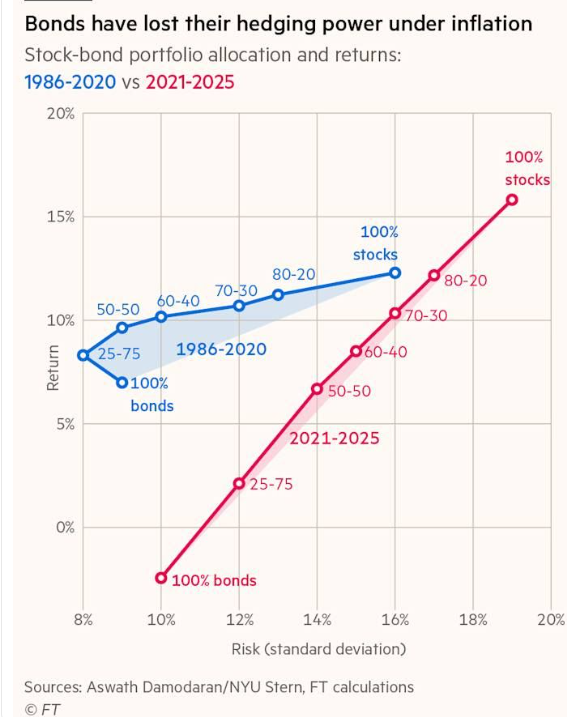
The chart compares different combinations of stocks and bonds during two very different periods: 1986–2020 in blue and 2021–2025 in red.
And those two lines couldn’t possibly look more different.
Before we get into why, we need to understand what the chart is actually measuring.
What Does “Risk” Really Mean?
Look at the bottom of the chart.
That’s risk, measured by something called “standard deviation.”
Don’t let the term scare you. We’re just measuring how much your portfolio moves around.
Think of it as bumpiness.
The further left you are on the chart, the smoother the ride. The further right you go, the bumpier things get.
It doesn’t mean that 10% risk gives you a 10% chance of losing money. It also doesn’t mean you can only lose 10%.
It simply tells us how much returns tend to swing around.
The other side is even easier. The vertical axis shows returns.
Higher is better.
So if we’re building a portfolio, we’d ideally like to move up and to the left.
More return, less bumpiness.
And for decades, bonds helped investors do exactly that.
Look at the blue line.
From 1986 through 2020, a portfolio of 100% bonds produced roughly 7% annual returns with relatively low volatility.
But here’s where it gets interesting.
You could start adding stocks and increase your returns without dramatically increasing your risk.
A portfolio with 25% stocks and 75% bonds actually produced higher returns than 100% bonds with roughly the same amount of volatility.
Add even more stocks, and returns continued to improve.
That’s diversification working exactly the way they teach it in finance class.
Stocks zig, bonds zag.
Put them together and you could get a better combination of risk and return than you could get from either one alone.
This is basically the idea behind the now infamous 60/40 portfolio: 60% stocks and 40% bonds.
For a very long time, it worked beautifully.
Then something changed.
We’ve been arguing that 60/40 is now really just 100.
We’ll come back to that, because it might be the most important lesson in this chart.
That’s When Inflation Showed Up
Now look at the red line.
This is 2021 through 2025, a completely different picture.
During this period, a portfolio of 100% bonds actually lost money while still experiencing plenty of volatility.
Think about that.
The supposedly “safe” part of the portfolio wasn’t just producing lousy returns. It was bouncing around while losing money.
As you moved from bonds toward stocks, the relationship became almost a straight line.
More stocks meant more volatility.
But it also meant much better returns.
In other words, bonds still reduced some of the bumpiness. But investors were giving up a whole lot more return to get it.
Why?
Inflation.
When inflation takes off, interest rates tend to rise. And rising interest rates can be terrible for existing bonds.
Imagine you own a bond paying 2%. Then suddenly new bonds are being issued paying 5%.
Who wants your 2% bond?
Nobody does, unless you sell it to them for less money. So the price of your bond falls.
That’s one of the big problems with inflationary environments. Inflation and rising interest rates can hurt stocks and bonds at the same time.
And if stocks and bonds are both responding to the same risk at the same time, you’re not nearly as diversified as you think you are.
That’s exactly what this chart is showing us.
And this is why we’ve been spending so much time watching what’s happening in the bond market.
So What Do I Do About It?
This is the part that matters.
I’m not telling you to sell all your bonds.
And I’m definitely not telling you to put 100% of your retirement account into stocks.
What I am saying is that we probably need to stop assuming that owning bonds automatically means we’re diversified.
That’s the mistake.
For decades, investors could own stocks and bonds and reasonably expect them to behave differently. When stocks struggled, bonds often helped. That made the traditional 60/40 portfolio incredibly useful.
But when inflation is the problem, that relationship can change.
Stocks can fall because interest rates are rising. Bonds can fall because interest rates are rising.
Suddenly the two things you thought were protecting you from each other are getting hit by the same thing.
That’s what I mean when I say 60/40 can really just be 100.
You own two different investments on paper, but they’re responding to the same risk.
So the question isn’t simply, “How much do I have in stocks and how much do I have in bonds?”
The better question is:
“What do I own that can actually perform well in the environment we’re in?”
If inflation remains higher than it was during the 1986–2020 period, the answer may look different than it did for our parents.
Maybe that means owning fewer long-term bonds. Maybe it means keeping more of the defensive side of the portfolio in shorter-term bonds or cash, where rising interest rates don’t hurt nearly as much.
And maybe real assets deserve a bigger seat at the table.
Gold. Commodities. Energy. Materials. Infrastructure.
I’m not saying you need to own all of these things. And I’m certainly not saying they’ll always go up when stocks go down.
The point is that diversification should be about owning assets that respond differently to different environments, not simply checking the box that says “I own bonds.”
That’s a huge distinction.
There’s another practical takeaway here.
If you’re 35 years old and investing for the next 30 years, volatility isn’t necessarily your biggest enemy. You have time.
If you’re 70 and living off your portfolio, that’s a completely different conversation. You may happily sacrifice some return for stability and income.
There’s nothing wrong with that.
But you should know what you’re paying for.
Look at that red line again.
From 2021 through 2025, investors gave up enormous amounts of return as they added bonds to reduce volatility.
Maybe that’s a trade you’re willing to make.
Maybe it isn’t.
But at least now you know the trade you’re making.
Because trillions of dollars are still invested based on an assumption that worked spectacularly well for almost 40 years:
Stocks are for growth. Bonds are for protection.
That assumption might still work again.
But we shouldn’t blindly build portfolios based on what worked during a completely different inflation and interest-rate environment.
That’s the real lesson from this chart.
Don’t ask whether bonds are good or bad. Ask whether they’re doing the job you hired them to do.
Because if they’re not, you better know what is.
Stay sharp,
JC Parets, CMT
Founder, TrendLabs